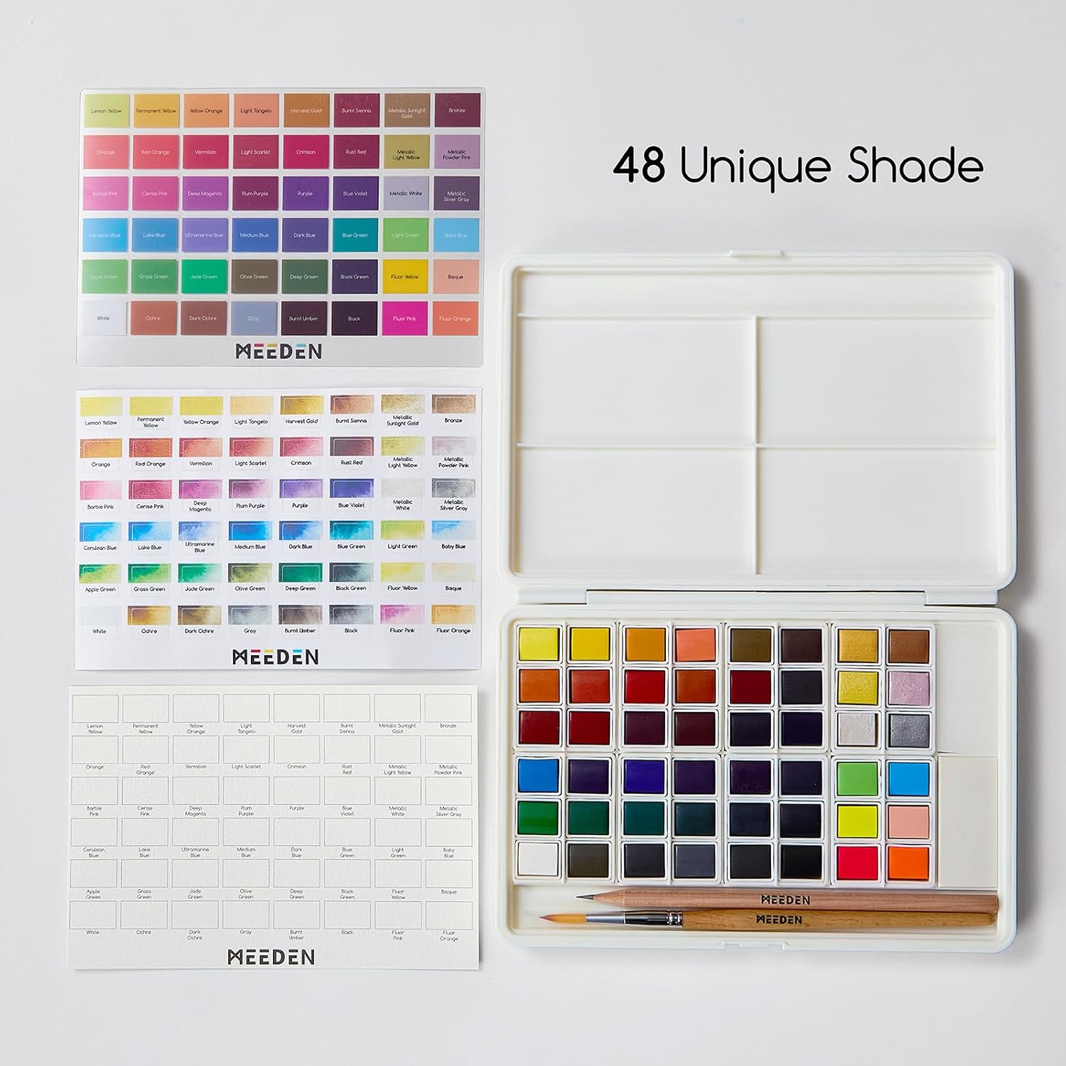
An Evolving Palette
To empty your tubes, a plastic palette with a closing lid will be perfect. Mine contains 24 wells, which is more than enough. I appreciate these because they are shallow and perfectly flat (there are also palettes with small airtight individual compartments, but those are rather reserved for very liquid washes). If you cannot find it in your favorite store, ask to order it.

Everyone can arrange it to their own convenience. You will gradually empty your paint tubes into the storage compartments (also called pans) arranged along the edges of the palette. Once the watercolor paste dries in the pans, it does not need to be changed when you start painting again. However, before and after each use, it is recommended to clean the surface of the deposited colors with water, especially the yellows, which risk getting contaminated.
You will prepare your mixes and pigment textures in the larger basins provided for this purpose in the center of the palette.
"Before starting a new watercolor, make sure your colors are clean and in sufficient quantity. If necessary, refill the wells. And always moisten the surface of your colors with a spray bottle!"
An evolving palette like this one (closed, it measures 14 x 30.5 cm) will allow you to store up to 24 colors. At the beginning, a blue, a yellow, a red, then several blues with different pigment properties, a warm red and a cool red (leaning towards pink), an earth tone, then still more blues, more reds, optionally another yellow, etc.

Inside the palette, you will group together the blues, yellows, reds, and earth tones. For example, the greens at the top left, then the blues, a violet, the cool reds, then at the bottom the earth tones and warm reds, on the right the orange, the yellows, and finally, if you like them, a gray, white, and black: yes, you are allowed to use them!


Which colors to choose?

You could also add a cadmium red, a scarlet lake, an underfoot violet from Daniel Smith, a Chinese white (transparent) or titanium white (opaque), etc.
Example of diversification
- 3 colors: Yellow (preferably a lemon yellow) + Magenta + Cobalt Blue.
- 7 colors: + Schmincke Orange + Winsor Red + Winsor Blue (Green Shade) + Mars Black.
- 12 colors: + Light Cobalt Turquoise + Natural Sienna + Perylene Maroon + Carmine + Ultramarine Blue.
- 17 colors: + Sap Green + Indian Yellow + Burnt Sienna + Cerulean Blue + Winsor Green.

These results depend on the dosages used. To know them better, create a color chart by mixing them two by two and then three by three.
Example of a Chromatic Triangle
- The three primary colors: Blue (cool), Red (warm), and Yellow (very warm).
- The secondary colors: Green (blue + yellow), Orange (yellow + red), and Violet (red + blue).
- The tertiary colors: Ochre (orange + green), Brown (green + violet), Russet/Maroon (violet + orange).
"You can absolutely mix brands together (be careful, some, like Mijello®, are sometimes more difficult to mix)."